

How We Redesigned a 13-Year-Old Food Industry Platform: A UI/UX Case Study
Overview
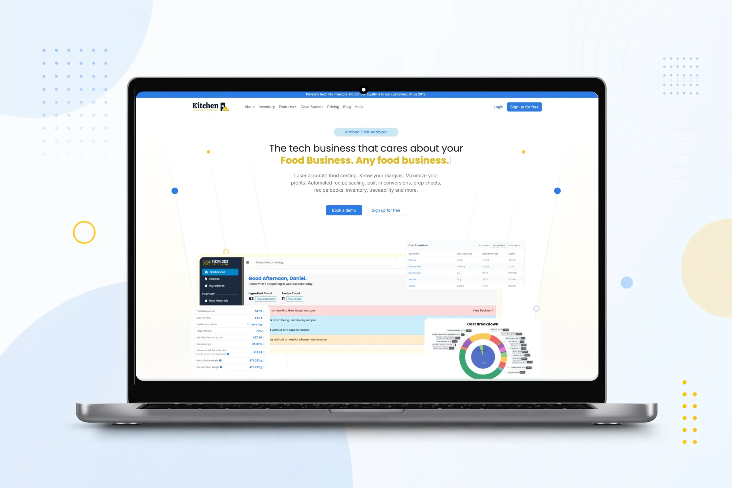
Recipe Cost Calculator has been serving restaurants and food businesses for over 13 years. Loyal users. Solid reputation. A product that genuinely worked.
But when Daniel first reached out, he said something we don’t hear often enough: “The product works. It’s just… hard to look at.”
That was our brief. Not to fix a broken product but to bring a great one up to speed.
The Challenge: A Product That Had Outgrown Its Own Interface
The platform had grown steadily for over a decade, and the interface had grown complicated along with it.
Users were getting stuck in workflows that should have been simple. Navigation felt outdated. The experience no longer reflected the quality of the product underneath.
A few things made this harder than a typical redesign:
- The product was live, with real users relying on it every day
- A full rebuild wasn’t an option. It was too risky, too disruptive
- Every change had to fit into an existing system without breaking what worked
We had to make it feel brand new without pulling the rug out from anyone.
The Solution: Starting With the User, Not the Design
We started where it mattered most: understanding how users actually used the platform.
Where were they losing time? What did they do every single day? What was getting in the way? Once we had those answers, the redesign had a clear direction.
From there, we rebuilt the interface around real workflows:
- Cleaner layouts that reduced visual clutter
- Simpler navigation so users could find things faster
- A consistent look and feel that matched the product’s maturity
We were careful not to over-engineer it. Every addition was deliberate just enough to make the experience feel smooth and responsive, nothing more.
We also sorted out the way the product was built and deployed behind the scenes, so Daniel’s team could ship updates reliably without the usual headaches.
The Impact: Users Noticed. Right Away
When we handed it over, Daniel had a product he could proudly put in front of new customers while keeping everything existing users already trusted.
The difference was immediate. Users noticed right away. Workflows felt faster. The interface felt intentional. And the team finally had a foundation they could build on with confidence.
For a product that had spent 13 years earning its reputation quietly, it was good to see it finally look the part.
Industry
Restaurant / Food Industry
Provided Services
UI/UX Redesign, Frontend Development, ERB Template Integration, Docker-based Environment Setup
Tech Stack
HTML, ERB, CSS, JavaScript, Bootstrap, Docker
Location
Columbia
Client Name
Daniel Wintschel